
Take a look at the bride images in Figure 1 below.
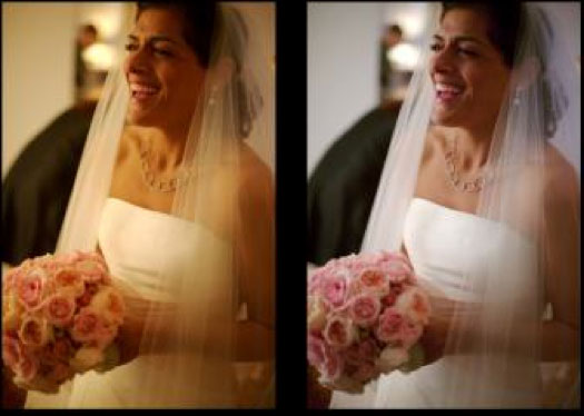
Figure 1. Left photo, taken under incandescent light looks reddish. In the right photo, some red has been removed to make the photo look like it was taken under natural light. Source: documentation.apple.com
In the left image, the bride's wedding dress has an orange tint instead of the traditional white. In the right hand picture a "white balance adjustment" has been made with a computer algorithm so that the dress looks the right color—white. It's easy to explain the left image: light from incandescent light bulbs is somewhat reddish so if you take a photograph under an incandescent light bulb everything looks somewhat reddish. The color-corrected "white balanced" right image is also easy to explain: the computer algorithm lowers the level of red color in the image, reversing the effect of the light bulb's reddish light. What's harder to explain is that the dress looked perfectly white to the photographer who took the picture, even though he/she was viewing it under incandescent light. In fact, many of us have had the experience when our night-time party photos (taken without a flash) look so much redder than we remembered. Does our eye/brain system automatically run a "white balance" algorithm on the images formed in our eyes? The answer is yes but in a way that is more sophisticated than white balancing algorithms for digital photos.
To see how white balancing algorithms work in a computer (or digital camera) it's important to know what we mean by "white." First of all, "white" is relative. Something that looks white will look gray when compared to a brighter "white." Figure 2 shows a room with "white" walls. Notice all the "whites" are just different intensities of gray.
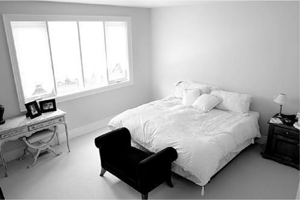
Figure 2. The walls are white, but the part of the wall on the lampshade side of the bed looks gray in comparison with the part of the wall on other side of the bed, which looks gray in comparison with the window light, which would look gray in comparison with an even brighter white. Source: cdn.homedit.com
So by "white" we mean the brightest shade of gray in the context of the image. With that settled, let's move on to how a TV screen makes gray (a.k.a. different intensities of white). To make the screen all gray, the screen pixels put out equal amounts of red light, green light, and blue light. Say, 100 units of red, 100, units of green and 100 units of blue. This is why we think of gray as colorless, there's no preferred hue. Now if we make the light output of the pixels on half of the screen become 200 units of red, 200 units of green, and 200 units of blue, we get the same color (gray) but at twice the brightness. In comparison with the 100 level side, the 200 level side looks white.
Now, let's design an algorithm that can automatically restore a bride's white dress photographed under the reddish light of an incandescent bulb. One way to do this is to find a part of the image where the red, green and blue pixels are as close in intensity to each other as possible (i.e. as colorless as possible). Say, we find an area that is 115 red, 100 green, 100 blue in value. Our algorithm should then assume this was an originally white object even though it looks like it has a reddish hue. So we artificially dim all the red pixels in the image by multiplying the magnitude of every red pixel output by 0.869. This is because—with some rounding off—0.869 times 115 equals 100. Note that we left the green and blue values at the same 100 value. Now the almost colorless object becomes entirely colorless, with red, green, blue values of 100,100,100. This is the likely algorithm used in the bride photo. In industrial applications, we do something similar for "white balancing" except instead of a bride's dress we use a standard object called a gray card.
Does this type of algorithm work all the time for the day-to-day visual needs of humans? The answer is no! Take a look at the snow in Figure 3. The snow in the direct sunlight clearly looks white, but what about the snow in the shade? To a skier present at the scene it will appear as shaded white snow. In the image, it looks a bit bluish to us. It would look a lot bluer if we covered the image with our hands except for the shaded snow. Even not present at the scene and just viewing the image our eyes use image context to correct for the blue tinted areas so the shaded snow looks grayer than the sky. But Figure 4 with the same image color-inverted shows the shaded snow part of the image is closer in color to the sky than to the snow. It is as though our brain's white balance algorithm uses our memory of what color snow is supposed to be. This is a far more interesting algorithm than just multiplying by a number like 0.869.

Figure 3. The snow in the shade is as blue as the darker parts of the sky, Though a person at the scene would at first glance associate it with a grayer color, possibly to fit with his/her idea that snow is supposed to be white. Source: digital-photography.com
More in my next article in this series on the human perception of color...

Figure 4. With the image in Figure 3 color-inverted it is easier to see that the color of the shaded snow is closer to the sky color than to the color of the sunlit snow.

Ari Siletz is president of CCDMETRIX. His company specializes in automated vision system inspection and metrology. With a background in both optical and software engineering, Ari has been developing instruments for the the ophthalmic and optical coating industries since the 1980s. Writing is one of Ari's serious hobbies. He is a published author whose short stories have appeared in numerous literary anthologies. He lives in Sebastopol, California.